Current Surface Mass Balance of the Greenland Ice Sheet
Thanks to Polar Portal for the data!
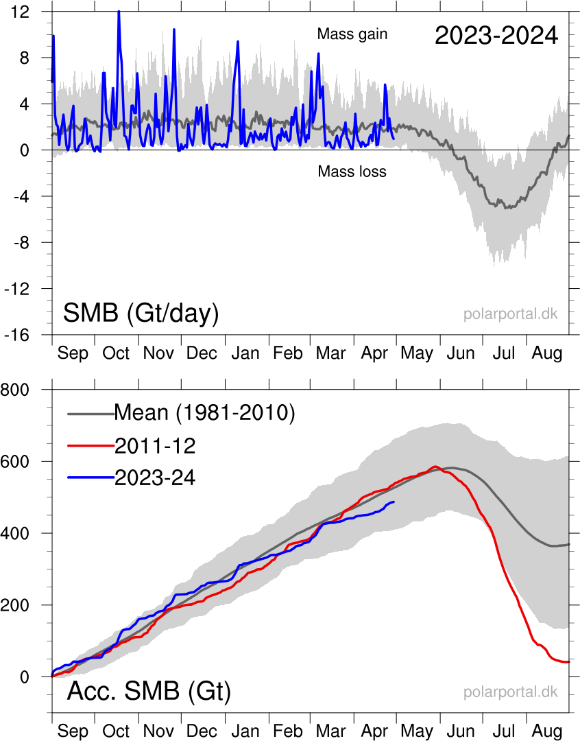
| The figure below shows the total daily contribution from all points on the ice sheet.The blue curves show this seasons surface mass balance in gigatons (Gt; 1 Gt is one billion tons and corresponds to 1 cubic kilometer of water), and for comparison the mean curves from the historical model run are shown with two standard deviations on either side. Note that the accumulated curve does not end at 0 at the end of the year. Over the year, it snows more than it melts, but calving of icebergs also adds to the total mass budget of the ice sheet. Satellite observations over the last decade show that the ice sheet is not in balance. The calving loss is greater than the gain from surface mass balance, and Greenland is losing mass at about 200 Gt/yr. |

|
The blue curve shows the current seasons surface mass balance measured in gigatonnes
(1 Gt is 1 billion tonnes and corresponds to 1 cubic kilometre of water). The red curve shows the season 2011-12 which
had very high summer melt in Greenland. The dark grey curve traces the mean value from the period 1981-2010. The light grey
curve shows differences from year to year. For any calendar day, the band shows the range over the 30 years (in the period 1981-2010), however with the lowest and highest values for each day omitted.
|


 Howl Brewing
 Ocean Air